
3D printing and carbonization of porous electrodes
Additive manufacturing offers a useful approach for creating porous electrodes with controlled geometry and tunable features. In our group, we use DLP 3D printing to fabricate highly controlled architectures that can later be carbonized into conductive electrodes. This blog provides a practical overview of the workflow, from CAD design to printing, cleaning, and carbonization, based on our lab’s standard operating procedures.
Learn more here
By Sonia Khalghollah & Maxime van der Heijden
1. Designing porous architectures
Porous electrodes begin in CAD software, where geometry, pore size, tortuosity, and mechanical constraints can be controlled with precision. Software such as AutoCAD, SolidWorks, Fusion 360, or code‑based generation tools can be used to create STL files for printing. This design flexibility is essential for tuning mass transport, hydraulic resistance, and electrochemical performance, as shown in our published works on deterministic electrode architectures. Once the structure is designed and exported as an STL, it is ready for support generation and slicing.
2. DLP/SLA printing – What it is and why we use it
DLP/SLA (VAT photopolymerization) uses projected UV light to cure thin layers of a photopolymer resin, building parts layer‑by‑layer. This method allows very high resolution, making it ideal for the porous frameworks required in redox flow batteries. In our research, VAT photopolymerization has demonstrated excellent control over feature size, reproducible pore geometries, and tunable mass‑transfer behavior in 3D‑printed electrodes. DLP printing is particularly well‑suited for producing carbonizable polymer scaffolds, as certain resins form stable and robust carbon frameworks after inert heat treatment.
3. Preparing prints in CHITUBOX (supports, slicing, exposure settings)
Once the STL file is designed, it must be prepared for printing using CHITUBOX or comparable slicing software. This step translates the CAD geometry into a layered, printable format and ensures that the structure will print reliably.
Software setup
Before slicing, ensure that the appropriate software, such as CHITUBOX, is installed. All designs must be exported as .STL files before they can be imported into CHITUBOX.
In CHITUBOX, the following workflow is used:
- Load the STL file into the software.
- Check all dimensions using the measurement tools.
- Orient the model, typically perpendicular (vertical) to the build plate, which helps with part removal and reduces deformation during printing.
- Select printer and resin settings, including:
- Layer thickness (e.g., 10 µm)
- Exposure time (e.g., 1.5 seconds)
- Number of bottom layers
- The printing settings depend both on the specific printer model, some offer far more configuration options than others, and on the resin used. For guidance on selecting appropriate starting parameters, refer to the Supporting Information in this paper.
- Add supports using the automatic generator.
- Support strategy is essential. Too few supports can cause print failures, while too many make removal difficult and may damage fine features. For unusual geometries, manually inspect critical regions and add additional supports as needed.
- Information on standard settings used in our group can be found in the Supporting Information in this paper.
- Save the pre-sliced file, as changes cannot be made after slicing.
- Slice the design and review for errors.
- Export to USB and prepare for loading into the printer.
4. Printer setup and operation
Standard printing method
DLP printing cures resin layer‑by‑layer using UV projection. In our group’s workflow, a layer height of 0.010 mm is typical, with around 18 bottom layers at long exposure times for strong adhesion. The remainder of the print uses shorter exposures to preserve resolution, for example 1-1.5 seconds. Because exposure times depend on both resin chemistry and feature size, researchers should determine optimal values through a careful trial‑and‑error process to avoid over‑ or under‑exposing fine porous features.
Zone-based exposure (optional)
Some printers offer zone‑based exposure, where different regions of the build plate receive different curing times. This feature is useful for determining the optimal exposure time for a given resin. To use it, prepare a CHITUBOX file with prints placed in each zone and assign exposure gradients (e.g., lowest bottom-right, highest top-left).
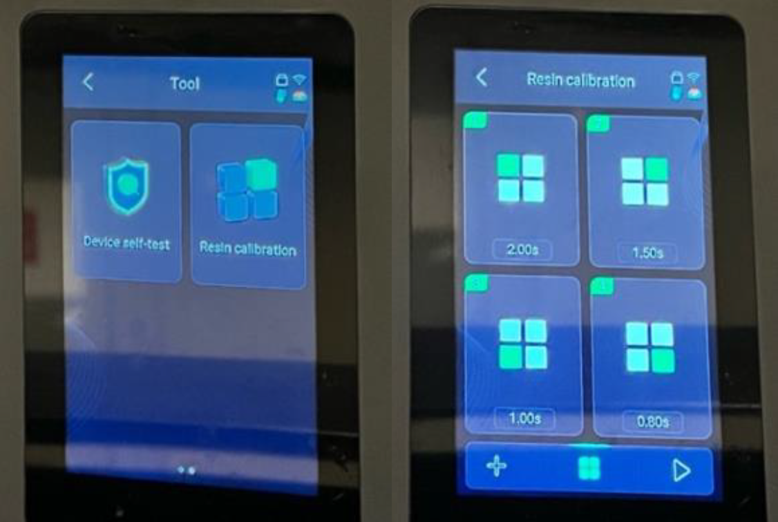
Figure 1: The ‘Resin Calibration’ feature found in the Tool’s section of the Elegoo Saturn 4 Ultra 16K 3D printer.
Printer preparation
Before starting a print, make sure the printer is properly prepared:
- The build platform is clean and securely locked in place.
- Resin level is sufficient for the print.
- The resin tray film is intact, with no tears or leaks.
Check the film before each print and monitor it regularly for leaks. If the film is damaged, it must be replaced before printing.
Once ready:
- Start the print.
- Insert the USB drive.
- Load the file to the printer’s internal memory (recommended for repeated prints).
- Adjust exposure if needed (this can also be done on CHITUBOX).
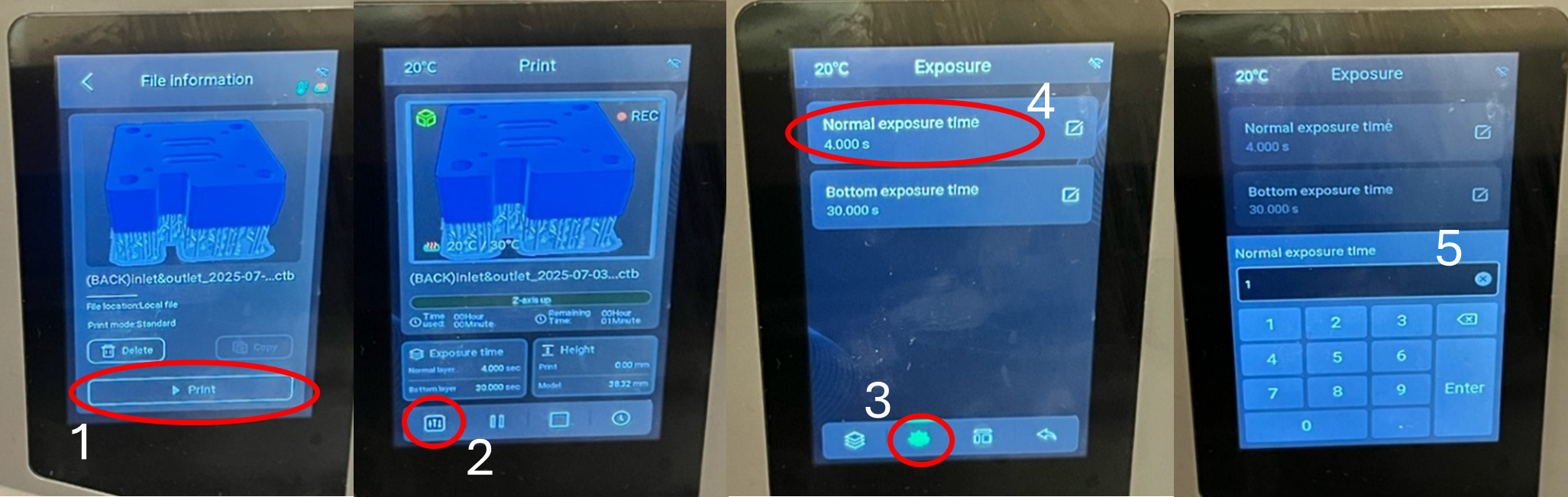
Figure 2: Step-by-step process for adjusting the exposure time directly on the Elegoo Saturn 4 Ultra 16K 3D printer.
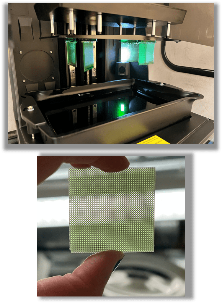
5. Removing prints and cleaning (IPA wash & UV cure)
After the print finishes, follow the following standard post‑processing steps:
- Remove the build platform using the release handle.
- Gently pry prints off using a plastic scraper; avoid metal scrapers unless absolutely necessary.
- Wipe away excess resin with paper towels.
- Clean the build plate with fresh IPA until it is no longer sticky.
- Rinse the prints manually to remove most surface resin, then place them in the Wash Station for a full wash cycle (for example 10 minutes).
- Inspect the prints and repeat washing as needed, or use an ultrasonic bath if additional cleaning is required.
- Dry the prints thoroughly using towels or compressed air.
- Cure under UV light in the Cure Station (typically ~30 minutes, depending on resin type) to ensure full polymerization and increased material stiffness.
- Remove supports with flush cutters and inspect the prints for sharp edges, uncured areas, or remaining residue.
These steps ensure consistency and prevent resin contamination of printing equipment or later processing steps.
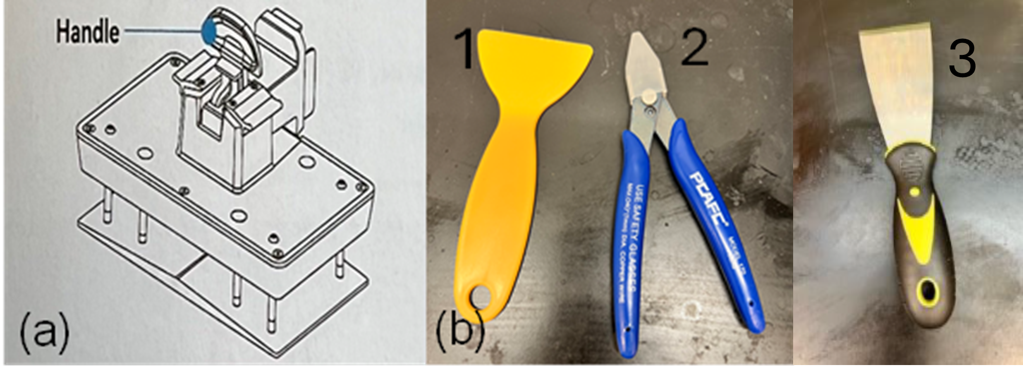
Figure 3: (a) The handle used in the 3D printer to secure and position the build plate. (b) Tools used during post-processing: (1) a plastic scraper for removing prints from the build plate, (2) a clipper/flush cutter for trimming supports, and (3) a metal scraper.
6. Carbonizing the printed structures
Carbonization transforms the polymeric scaffold into a conductive carbon framework suitable for electrochemical applications.
A typical carbonization workflow includes:
- Optional oxidation step to stabilize the polymer prior to high‑temperature treatment
- Controlled ramp to the target carbonization temperature (typically >800 °C)
- Isothermal hold (for example 1 hour) under an inert atmosphere (N₂ or Ar)
- Slow cooldown to minimize thermal shock and prevent cracking
Before selecting a carbonization protocol, we strongly recommend performing thermogravimetric analysis (TGA) to determine decomposition temperatures and estimate carbon yield. Significant structural shrinkage is expected during thermal treatment, this is normal and intrinsic to the carbonization process. For example carbonization treatments check out our related papers here and here.
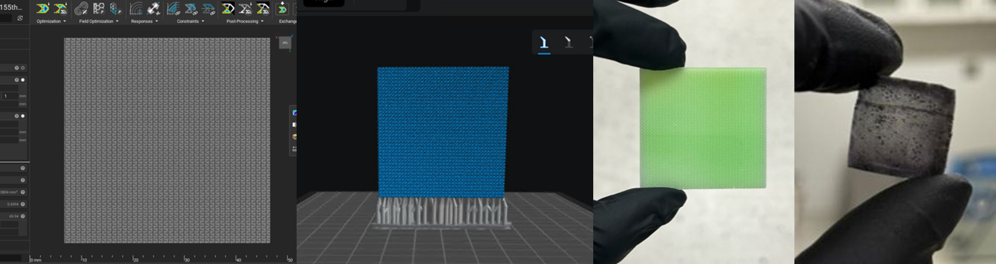
Figure 4: The printing workflow from design, printing software, after printing, to carbonization.
7. Tips & tricks
Printing tips
- Align structures vertically to allow for easier removal from the build plate
- Use the lowest reliable exposure time to maximize feature resolution
- Carefully verify support placement, especially for non‑standard or delicate geometries
Carbonization tips
- Carbonize samples within a ceramic or graphite support framework to prevent warping or collapse during shrinkage (important for thin‑walled porous structures)
- Use your TGA data to design safe and appropriate thermal ramps
- Expect significant shrinkage (often ~50%) and incorporate compensation factors directly into the CAD design
Conclusion
Combining 3D printing with controlled carbonization offers a powerful route for fabricating next‑generation porous electrodes. By carefully designing geometry, using robust DLP printing workflows, and applying optimized thermal treatments, researchers can tailor electrode performance far beyond what conventional materials allow. We hope this blog supports new researchers entering the field and advances the broader development of engineered porous materials.
Visualization with Paraview – Networks generated with the GA-RFB-electrode tool
We developed a Pore Network Modeling (PNM) tool for Redox Flow Batteries that provides an efficient way to translate real electrode structures into network representations, enabling direct links between microstructure and electrochemical performance. This allows structure–performance relationships to be identified and used to guide the design of next‑generation porous electrodes for electrochemical systems. The PNM‑RFB‑electrode code is fully open‑source and written in Python using OpenPNM.
This blog post focuses specifically on how to visualize the resulting networks and simulation outputs in ParaView, using the model described above.
Learn more here
To obtain a visual representation of the networks generated with the GA‑RFB‑electrode tool, the following procedure can be followed.
The first step is running the GA_to_VTK_and_properties_Windows script, generating the following output files:
- A folder under /output/GA/… containing:
- Polarization curve data
- Throat and pore information for each layer (for cubic networks)
- .vtp files for the anodic and cathodic networks, with and without surface pores
- A /output/GA/…_psd.xlsx file with the pore size distribution
- A /output/GA/…_velocity.vtp file containing absolute velocity and flowrate data
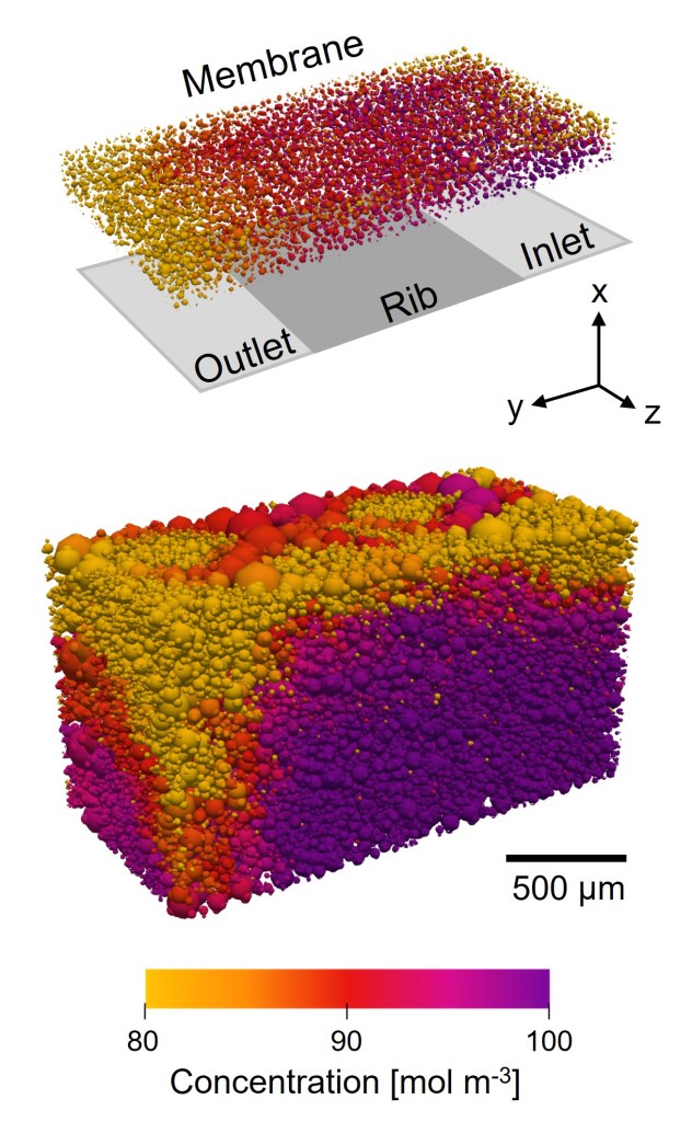
To generate pore size, concentration, absolute velocity, and hydraulic conductance visualizations, load the corresponding .vtp files into ParaView.
Pore Diameter Visualization
To obtain the .png figures, the following procedure can be followed:
- Adjust the camera. Use a consistent camera setup for comparable views. Figure 1 shows the settings used for the cubic network.
- Tip: Use ParaView’s preset camera orientations to identify network boundaries such as inlet, outlet, current collector, and membrane.
- Throat visualization. After loading the …_velocity.vtp file:
- Set Coloring to Solid Color. Suggested RGB values: cubic networks: (150, 150, 150) and extracted networks: (200, 200, 200).
- Adjust Opacity (e.g., 0.5)
- Increase Line Width (e.g., 2) under the Toggle advanced properties wheel in Properties
- Pore visualization. Apply a Glyph filter to the .vtp file and set:
- Glyph Type: Sphere
- Orientation Array: No orientation array
- Scale Array: network | net_01 | properties | pore.diameter
- Scale Factor: 1
- Glyph Mode: All Points
- Pore visualization. Then:
- Set Coloring to network | net_01 | properties | pore.diameter
- In the Color Map Editor change the Mapping Data by pressing the folder with the hearth (Choose Preset) to apply the Viridis (matplotlib) as color scale.
- Adjust the Set Range (second button in the Mapping Data) to match your pore diameters (e.g., 0 to 40e‑6)
- Edit the color legend as needed (Edit Color Legend Properties)
- Exporting figures. Use Capture Screenshot and save with Transparent Background enabled.
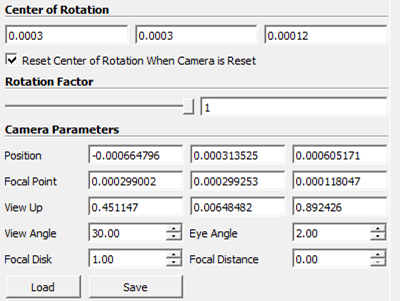
Figure 1: ParaView camera settings to visualize a cubic network example.
Pore Concentration Visualization
Follow the same steps as for pore diameter, but change:
- Coloring to network | net_01 | properties | pore.concentration
- Adjust the Set Range to match your concentration values (e.g., 95–100)
- Edit the color legend using Color Preset, for example to the “Concentration” scale available in the Image processing folder on GitHub
Absolute Velocity Visualization
Visualizing absolute velocity requires showing the actual throat sizes. Apply the following filters in order:
- Shrink
- Shrink Factor = 1
- Cell Data to Point Data
- Extract Surface
- Tube
- Scalars: network | net_01 | properties | throat.diameter
- Capping: On
- Radius: 1e‑6
- Vary Radius: By Scalar
After applying the filters above, adjust the following:
- Set Coloring to phase | catholyte | properties | throat.absolute_velocity
- In the Color Map Editor:
- For example choose the Absolute_velocity preset from the GitHub folder
- Set the range (e.g., 0 to 0.1)
Throat Hydraulic Conductance Visualization
Use the same filter sequence as for absolute velocity, but modify:
- Scalars and Coloring to phase | catholyte | properties | throat.hydraulic_conductance
- Set Range to match your conductance values (e.g., 1e‑20 to 1e‑12)
- Color Preset to Black‑Body Radiation, then invert the scale
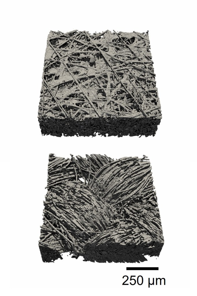
Image processing – X-ray computed microscopy
Processing X-ray computed microscopy data is a crucial step in preparing porous materials for further analysis, such as structural visualization or pore network modeling (PNM). Raw grayscale tomography data must be segmented so that each voxel is assigned to either the solid or void phase. This conversion enables quantitative microstructural analysis and the creation of accurate numerical models.
In this post, we demonstrate a complete image-processing workflow using Fiji (or ImageJ). The example illustrates how to align, clean, filter, and segment tomography stacks to produce high-quality binary images suitable for downstream modeling.
Learn more here
Before image processing, make sure that all the required plugins of Fiji are installed:
The workflow below can be executed manually or automated using the accompanying script (copy-paste into File → New → Script):
If you choose the scripted approach, make sure to verify and adjust each step for your specific dataset.
Image processing workflow
1. Load the tomography stack
Open your image sequence (typically a folder of 2D slices or a TIFF stack).
2. Open the Memory Monitor and Recorder
– Plugins → Utilities → Monitor Memory
– Plugins → Macros → Record
These tools help track memory use and capture commands for scripting.
3. Enhance image contrast
Use Image → Adjust → Brightness/Contrast to improve visibility of solid/void distinctions.
4. Crop the image and free memory
Use a rectangular selection and Image → Crop.
Then run Plugins → Utilities → Collect Garbage.
Cropping helps avoid memory issues during the computationally heavy rotation steps.
5. Rotate the sample
Use Image → Transform → Rotate.
Adjust using the preview to align the sample horizontally or vertically.
6. Reslice the image
Image → Stacks → Reslice.
This enables inspection from alternate orientations (Top/Bottom/Right/Left) and requires entering the correct voxel size (3.3 µm in this example).
Run garbage collection again.
7. Iterate rotation and reslicing
Repeat steps 5–6 until the sample is aligned properly in all directions.
Optional cropping can be applied, but note that image edges may be lost with repeated rotations.
8. Remove slices outside the sample
Plugins → Slice Remover.
Delete ranges without useful sample content.
9. Apply noise reduction
Process → Filters → Median.
Here we use a 2D median filter with a radius of 2.0 px to smooth grayscale noise while preserving edges.
10. Segment using K-means clustering
Plugins → Segmentation → k-means clustering.
Use the following settings:
- Clusters: 2
- Interpret stack as 3D
- Enable randomization seed
- Show clusters as centroid_value
11. Refine with thresholding
Image → Adjust → Threshold.
Choose Auto, then Apply to finalize the binary image.
12. Crop to the final region of interest
Define your ROI (region of interest) and use Slice Remover where needed to produce the final clean stack.
13. Save the output
Export the processed images as .tif.
TIP: if working with large tomography datasets, use a system with sufficient RAM and close any unused files to avoid memory bottlenecks.
Example script: below (Figure 1) is a preview of the accompanying ImageJ macro used to automate the workflow:
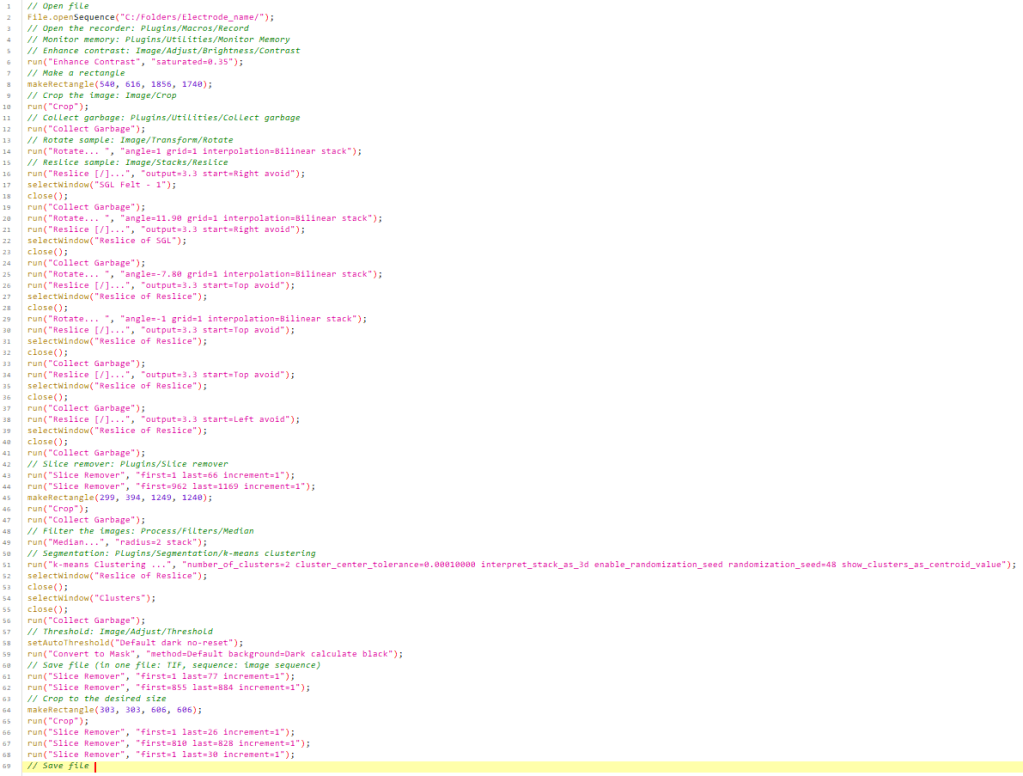
Figure 1: Image processing script example.
